Flomar Civil Engineering
In a saturated market that preaches to “buy the vision,” they discovered their outdated branding was hindering them, ineffective against Goliath industry giants.
Refresh a civil engineering brand so it can hold its own next to industry giants (visual identity, website, signage). Make it look the part for large corporate players; big dog stuff. Weave in one owners Irish heritage. Seek a +22% rise in tenders won from ideal clients in 6 months. Make no mistakes.

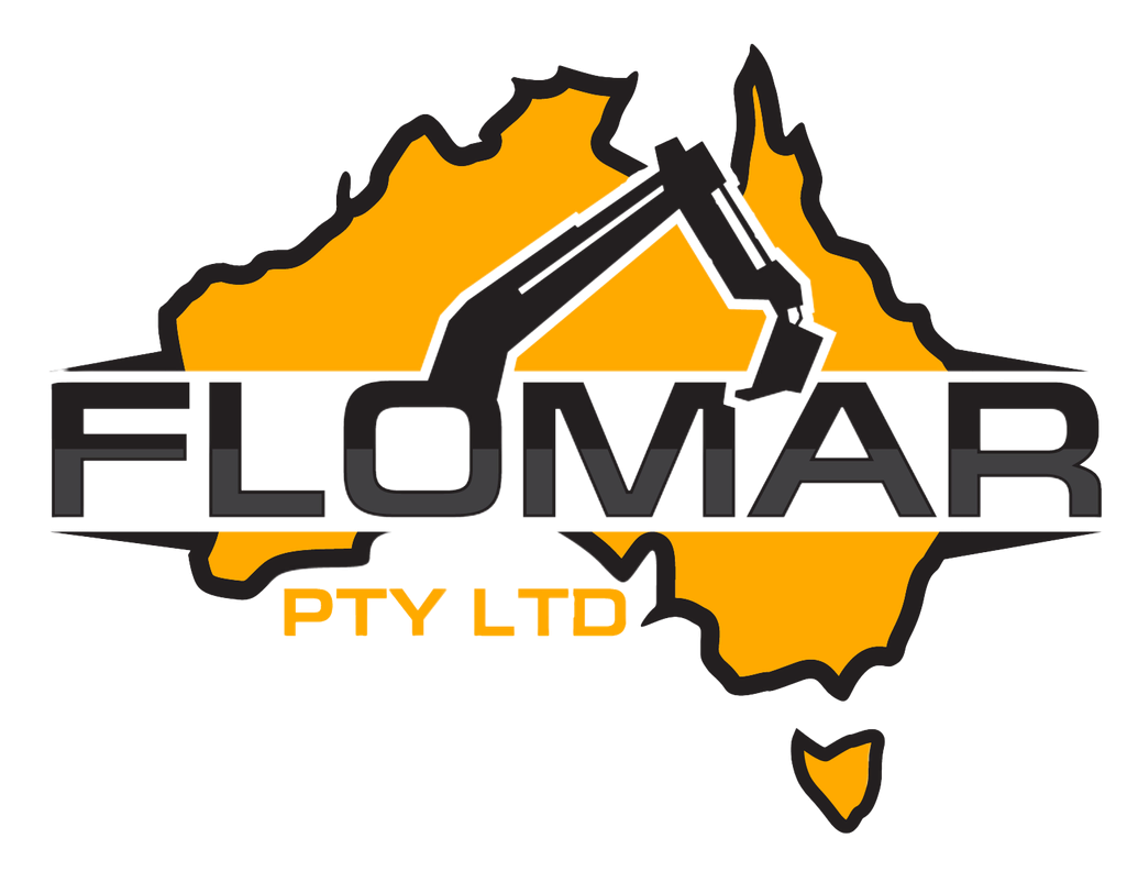
Taking a leaflet out of Pepsi’s book, we looked to creative to solve a divided Ireland. Jokes, but imagine. I did bring microsoft clipart into modernity, but that just about sums up our systematic impact here.
How it started
The brand looked old, but 80% of the faces looking at me didn’t have sun damage: and these were tradies in Australia. In the bustling city of Sydney, Flomar Civil provides prompt and competitively-priced engineering services in metro and urban areas. The business had expanded, they were winning more tenders, but there was just one problem: none were from clients they wanted, the big and the corporate.
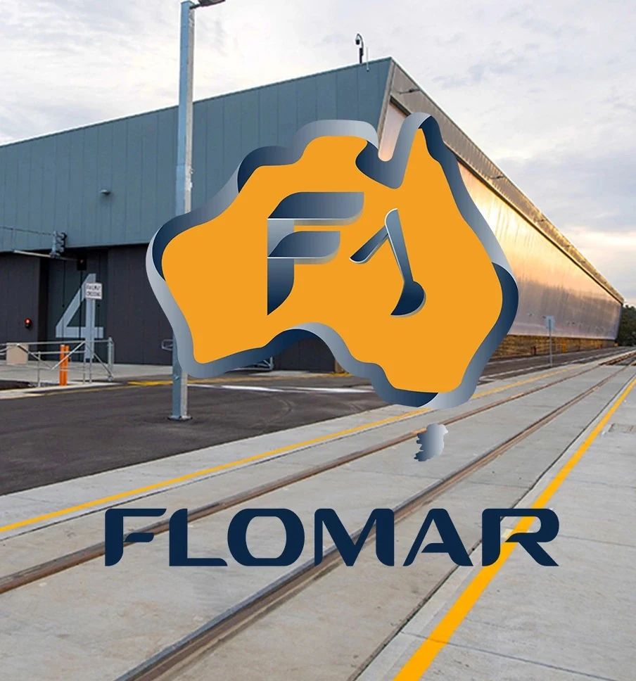
In a saturated market that preaches to “buy the vision,” they discovered their outdated branding was hindering them, ineffective against Goliath industry giants. Especially when sat side-by-side. So to revitalise their market presence and gain an aesthetic competitive edge, we took to gradient-filled strokes, a popping palette, and graduated our clipart into elevated iconography.
How it’s going
While we mightn’t have collected the same return, the youthful facelift did for Flomar Civil what heritage restoration does for Sydney house prices. We started to win the big and the corporate, specifically 22% more, and in just six months.
In 2020, construction in Australia largely paused due to COVID lockdowns. Behind the scenes and the brand facelift, at a time of uncertainty in both the world and work visas, the owners wanted the largely Irish team to feel connected to the company they were pushing forward. And all you’d have to do is look at the bottom right of the artwork… At first glance, Tasmania might look wrong; but rub your eyes and check again, because that’s a united Ireland. Just call me Kendall (adjacent).
Rebuild the website for the big and corporate clients: a site that holds its own beside the industry giants, on a phone on site as much as at a desk.
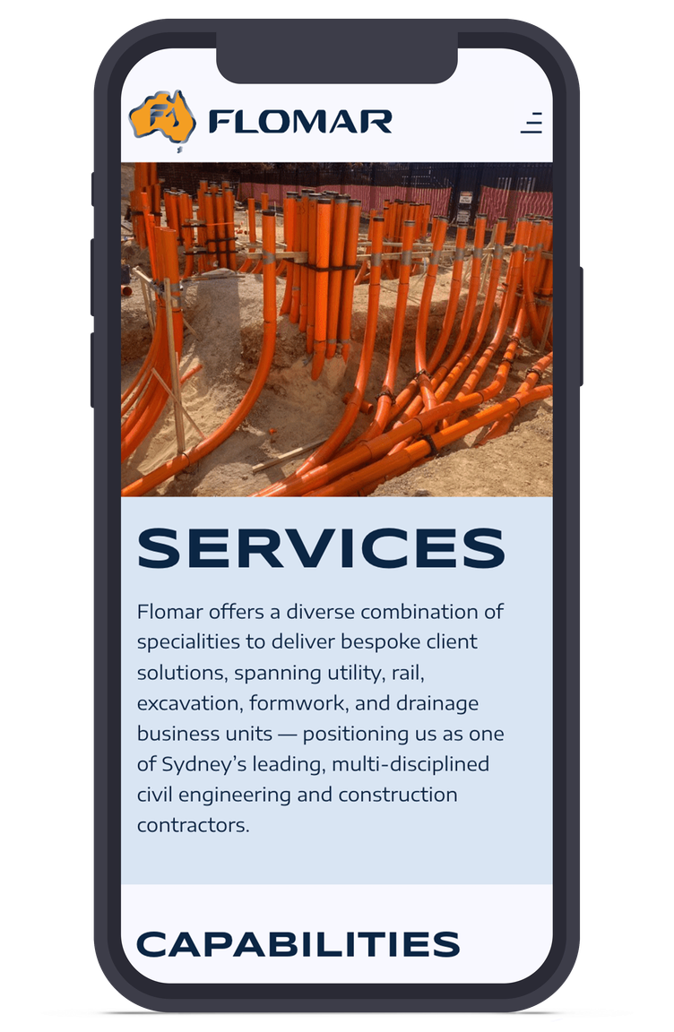
Refresh the identity: gradient-filled strokes, a popping palette and clipart graduated into iconography, with a united Ireland tucked in the corner.
Brand applications
The horizontal logo.